sketchbooks

20131231_4314RB

I am still catching up with a few posts I had wanted to create, but didn’t make time for.  So going back to New Years Eve (yikes!) … some photos and a few pages from my sketchbooks.

To ring in the New Year, we decided to head to the mountains and spend a few days in a quiet cottage – with family, a warm fire in the hearth, and a little hiking.  Rather opposite of typical New Years festivities, with no ball drop and no glamorous champagne parties.  We didn’t even have television to speak of – just an old set with VCR and a few ancient videos.  With no internet connection or cellphone reception on the secluded grounds around the mountain cottage there was no email, no texts nor anything else – which turned out to be completely perfect.  We hiked, we played board games, we enjoyed wine and tea and coffee by the fire.  We gathered in the kitchen to cook  together.  We laughed and enjoyed each others’ company without unwanted interruption, which is exactly how it should be.  And so began 2014.

20140101_4016RF

20140101_4187RB

20140101_4005B

20131231_4305RF

The quiet days also gave me time to work a little in my Moleskine watercolor sketchbook, both in the cottage and while on my “nature” walks.  We had some lovely hiking on the Appalachian Trail, with clear skies, frost on the mountain tops – but the temps were quite cold with very gusty wind, so I didn’t do any mountain-top sketching.

20140210_Canon_5137F

20140101_4083F

my thank-you in the cottage guestbook

20140109_iPhone_4403F

"nature walk" page - unfinished

I tend to be rather funny with my sketchbooks and journals … I concurrently keep a variety of types for a variety of projects (more to come about this).  As much as I have tried to condense things to one book for everything, it never works for me.  So for light travel, I love Moleskine watercolor journals and a small kit of pen and a few watercolors.

Back at home, I’ve been trying to expand my artistic horizons – trying out some new materials, working out of new sketchbooks/art journals, and even taking part in several online art classes.  It’s been challenging for me, but in a wonderful way. More to come…

one day of winter

20140128_Canon_4851R

In the South, it’s rare to see winter weather.  If it’s below freezing, it’s usually clear; seldom do we see snow.  One or two days a season – if we’re lucky.

For the first 30 years of my life, I lived in the North where snow, cold, ice and all things winter are the norm.  I confess that I miss it terribly; I’ve always been a winter person.  Someday I will return to live in a place where winters actually feel like winter.  Where I can ski and snowshoe, fish through a hole in the ice, watch the snow fall, and feel the cold air on my face.

For now, at home, I take a walk out behind our house and  rejoice in the rare beauty of this day – this one day where it feels like winter … a wonderful surprise.

20140128_Canon_4871R2

20140128_Canon_4827R

20140128_Canon_4830R

20140128_Canon_4852R

20140128_Canon_4901R

A Kauai Travel Journal (& Journey)

20140121_Canon_4777F

I’ve been away from the blog for a while, but have been busy with a variety of other projects – many of them “on paper” things.  Journaling, photography, studying, sketching, painting, and even taking an online art class.   The fruits of my labor have just not made it into the blog … yet.  For today, I’ve decided to go back to a project that began in September – which I posted about, very briefly, in my vintage/modern travel journal post.  (If nothing else, if your weather is wintery-cold and snowy like our is at the moment, it’s nice to remember sun, warmth, and sandy beaches).

20140121_Canon_4779F

Inspired by a wonderful travel journal and scrapbook put together by Melissa at Bursts of Creativity, I loved the idea of using this format for a trip we took in October and November (2013) to the beautiful island of Kauai.  The book was not only unique in construction, but was portable, expandable, and able to accommodate a variety of elements that I was interested in incorporating – from journal entries to photos to sketches and the typical collection of paper “stuff” (tickets, menus, brochures, etc.) that one always collects while wandering about new places.  Attached to the rings are souvenir key fobs, a landmark medallion, and a little cloth bag filled with shells.   As you can see, I think I filled my poor little book to the point of being a bit over-stuffed – but I rather like it this way.

a couple of on-the-go watercolor sketches and some vintage book pages

a couple of on-the-go watercolor sketches and some vintage book pages

underwater photo and vintage maps

underwater photo and vintage maps, journaling on a tag insert

Kauai Coffee: my photo and a brochure from the plantation

Kauai Coffee: my photo and a brochure from the plantation

Before we left, I de-constructed a vintage book of Hawaiian stories that I had found on-the-cheap in a local antique mall.  I partially filled the book with pages to journal and record on – a collection of saved illustrations from the original book, watercolor papers, writing paper, a couple of envelopes,  as well as some vintage Hawaiian postcards and ephemera I had purchased through Melissa’s Etsy shop.  But I saved plenty of room to “page-in” the many things I would collect and create while on my trip (the photos, brochures, menus, stickers, postcards, other sketches, etc.).

another on-the-go quick watercolor

another on-the-go quick watercolor

travel map, stickers and some notes

travel map, stickers and some notes

another quick watercolor, along the beach

another quick watercolor, along the beach

I took along a pretty simple tool-kit:  pencil, a drawing pen, a small watercolor palette and waterbrush, 2 rolls of washi tape, a hole punch, a glue stick and a tape runner.  I also took along a small-format block of watercolor paper; I found it easier to sketch/paint on the block and insert the pages later.  While I didn’t have any of my photos printed during the trip, it was easy to print them at home and insert them throughout the journal accompanied by travel notes I had kept on blank pages.

vintage postcards - with some space for journaling on the back

vintage postcards – with some space for journaling on the back

photo spread inserted upon return, with margin notes made while traveling

photo spread inserted upon return, with margin notes made while traveling

another photo-spread with notes

another photo-spread with notes

inside back cover lined with page from original book

inside back cover lined with a Glossary page from the original book

I also mailed a couple of postcards to myself during the trip – which was a nice way to write about what I was doing at a particular moment, where I was, what I saw.  Back at home, these postmarked and dated postcards were hole-punched and inserted into my little book – kind of an un-journal journal entry.

I loved being able to create this book quickly and easily while we travelled, filling it to brim.  It allowed me to enjoy all of the experiences of our trip with a minimal amount of time spent creating the journal.  It’s a great and flexible format for a variety of media – photos to written work to sketches – and I didn’t have to deal with a huge pile of collected brochures, tickets and papers when I got home.  I love the mix of vintage and present day in my little book.  But most of all, every time I pull it off the shelf I remember where I was when I was putting each page together … the sun, the ocean, the flowers and the beautiful island of Kauai.

20131031_Canon_1357RF

one of the most beautiful places in the world to reflect and record memories of travel … Kauai

20131031_Canon_1398RF

20131102_Canon_1148RF

20131102_Canon_0813RF

20131028_Canon_0495R2F

Appalachian

20131012_Leica_9147F

We spent the past few days camping and doing a bit of hiking on the AT up at Roan Mountain, in the high Appalachians in northeast Tennessee near the North Carolina border.   The weather started out cool, crisp and sunny – but turned to clouds and mists in the mountains, and a bit of rain at night.  Somehow, I think hiking the Smoky Mountains in the mists is quite fitting of its name; it brings its own form of mysterious beauty.

Up on the mountain, the hiking was cool and damp as we were engulfed in swirling clouds.  We couldn’t see out across the mountains from the open balds, which normally brings some breath-taking views  – but mist provided a sense of wonderful mystery and almost a sense of disorientation at times.  Lots of backpackers and day-hikers were out, regardless.

20131012_Canon_9216F

20131012_Leica_9149F

20131012_Canon_9262F

20131012_Canon_9239RF

On the Trail near Round Bald, there is a memorial to Pierce Templeton situated among some rocks – with a Bat Cape tied around the cross marker.    Apparently he was known as Batman.  I don’t know if he was a local, a through-hiker, or a devoted day-hiker, or some combination of … but seeing the cape fluttering in the mist was both moving and a bit eerie.  Rest peacefully, Pierce.

20131012_Canon_9223RF

20131012_Canon_9232F

20131012_Canon_9252RF

At Roan Mountain State Park we took some time to visit the historic Miller Farmstead.  The park was holding its annual Autumn Harvest celebration at the Farmstead, and we enjoyed getting to tour the grounds and the farmhouse, and also to parktake in some food and music.  A number of local craftspeople were on hand, showing their talents – from woodworking to soap-making to spinning.

20131012_Leica_9128F

20131012_Canon_9178F

20131012_Canon_9180F

20131012_Canon_9179RF

We enjoyed the sound of Appalachian folk music performed on the porch of the old farmhouse by a talented couple playing fiddle, banjo, dulcimer, autoharp, and guitar.

20131012_Leica_9132F

porchmusic

20131012_Canon_9187F

In the old Miller farmhouse – which was inhabited by the family’s descendents until the 1960’s –  the walls of the second-floor bedrooms are papered on old newspaper.  Remarkable to look at, and read the old dates, articles, prices of things in ads.  Apparently the papering was a cheap way to provide a little protection from drafts, maybe a bit of insulation.  As time has passed, it has yellowed and become tattered and peeling – yet I’m glad it remains.

20131012_Leica_9135RF

20131012_Leica_9137RF

The Appalachians in the fall have such an indescribable air to them – whether you are able to enjoy the fall colors on a clear sunny day, or hiking through misty glades of rhododendrons and patches of autumn-red high mountain blueberries, traversing mountain creeks and open balds.  It’s a beautiful place; come visit.

20131012_Canon_9188F

20131012_Canon_9167F

20131012_Canon_9173RF

20131012_Canon_9277F

20131012_Canon_9298F

my take on Chronodex

20130930_Canon_8697RF

First off, a tip of the hat to Patrick Ng at Scription for sharing his unconventional way of looking at time and planning through his Chronodex concept.  And I hope it is acceptable for me to put my own spin on things, as I have been using the Chronodex on the development of my own personal agenda pages – as outlined in this post.

I tend to do a lot of writing in my agenda – which currently is a red ostrich personal-size Filofax.  I am definitely a full-blown day-on-2-pages person, even though I am not a decorative sticker and washi-tape and scrap-book type of diary-keeper (don’t get me wrong – I admire those who create amazing pages this way, but it just doesn’t work for me personally).   I’ve used both Filofax and Franklin Covey systems, yet they never totally met my needs.

When I came across the Chronodex concept, I knew I wanted to give it a try; I was drawn to the visual almost clock-like manner of time-management.  Yet I know myself well – and I know that I am a list and checkbox person when it comes to certain things.  So I looked through all of my old archived pages and tried to pick out the key things that I was keeping track of on a daily basis to get a feel for what my needs are in an agenda page.  I thought I could come up with my own 2-page spread that incorporates all of my must-haves, along with the Chronodex for a visual depiction of daily time and scheduling.  And so, I cobbled together this spread and have been using it every day for the past month.  I’m happy to say I am quite pleased with the design for my own purposes, and thought that perhaps others might want to have a look.  (Or not.)

ChronoBasic

This is the blank spread, and I will go on by section to explain how I am using it, section by section (forgive me for the image-heavy post).

DateWeather

On the top of the left page with the date, I have a line for the weather.  Don’t ask me why I like to keep track of this, but I do.  Old habits die hard, I guess.  I don’t compile statistics or averages, nor do I monitor this at the same time each day, so it’s probably rather pointless;  I just like to take a look at the sky and at my thermometer and record at some point during the day if it’s sunny, cloudy, rainy or whatever, and what the temperature happens to be at any given time when I am thinking about it (usually over a cup of coffee).  Silly probably, but meaningful to me.

Sep3

Next comes my daily to-do’s.  Like I said, I am a list-and-checkbox person, and I like to plan my daily schedule around what I need to get accomplished.  When a task gets done, I tick the box; if I need to move it forward to another day, I put an arrow in the box.  I tend to block out time for these tasks and to-dos on my Chronodex, which comes next.

Chronodex

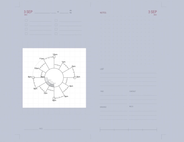
The Chronodex is next – and it is where I block out time for my at-home work tasks, appointments, physical activity (cycling, gym, yoga, etc.), and personal tasks.  The very top photo in this post shows the color-coding and time-blocking I use, which is basically four colors; green for at-home work/study, blue for physical activities, red for personal tasks, and purple for appointments.   I typically don’t draw connecting lines to text around the margins (it was too messy for me); I simply write any notes in the same ink colors, near the time blocks. I use a Coleto multi-barrel pen for blocking time on the Chronodex, but I still use my Waterman ballpoint for all other entries on my pages.

Watching

The last line on this page comes from an idea I saw on Planet Millie – who does some beautiful and artful diary pages.  She has a wonderful custom stamp that she uses to record what she’s reading, listening to, watching, and loving at any given time.  I liked the idea, and wanted to incorporate it into my daily pages for books I am reading, music, movies, and any other silly things that come to mind – like eating, drinking, photographing, etc.  So I left this as a fill-in-the-blank to suit my whim of the day.  Thank you, Millie, for the idea.

Notes

At the top of the facing page, I have a big dot-grid section for notes.  This is my everything-and-anything spot.  Typically, it random info or notes I need to jot down during the day; anything that requires lengthier note-taking or detailed sketching goes on a separate blank page in another (Project) tab of my Filofax.  But quick daily things land here; it’s kind of like a sticky-note section.  It may be a rough sketch, a phone number, a name, a reminder or whatever.  I am a big fan of nearly-transparent dot grids as it allows me to be flexible or structured, depending on what I am penning.  Great for quick sketches or for lines of text.

List

I decided to keep two lined columns for a list or lists.  Typically for me this is things like groceries, items I need to pick up or drop off, or other things I need to obtain locally.  Occasionally I use it for a packing list for an overnight trip, etc.  Anything that is not specifically a task, but where I need a list, this is the place for it.

Paid

This sections in this bottom half of the page come from examining what I was keeping track of in my archived planner pages.  First comes the Paid section – when I have scheduled a bill to be paid on a given date, it goes here.  When I need to look at when I paid a car insurance premium, a membership dues, a utility bill, etc., this provides an easy summary for me to look back at.  As shown in the very top photo, I also use a small Mark-It Dot for these sections, and put the same dots on my Chronodex for any day I have made an entry.  In other words, for anything I have listed under PAID – with the designation of a green dot – I also put a green dot on my Chronodex.  This is just a quick visual for me, and allows me to glance over at the various sections to see what I have paid, etc.

Contact

I added a Contact section for important contacts I make during the day.  When I have phoned the insurance company, or left a message for someone, or returned a form or application – this is where I make note of it.  Again, I like having this action-specific section for easy reference, and also use a Mark-It Dot (black) for this section and at the corresponding time on my Chronodex.

Ordered

The next section is for things I order – usually online or through a catalog.  I am a heavy on-line shopper, mostly because we live in an area with very limited availability of many items.  For the most part, on-line ordering is typically cost-effective, time-saving and provides significantly better variety in most things my family uses.  But I often had difficulty keeping track of what and when I ordered an item, from where, etc. – and then keeping tabs on when I received it.  So I begin by listing it in this section, as I place the order, but then I also will later transcribe any daily purchases to a master “running” list that I keep on a Filofax Financial page.  Again, for this section I use a yellow Mark-It dot on my Chronodex to reference back to this little list of things ordered on a given day.  On the Filofax Financial page (kept under a different tab in my binder) I list complete detail, cost, and method of payment, also the date of receipt.  When I receive something, I record the date and highlight it off the list.

20130930_Canon_8700F

Here is a shot of my Filofax Financial page where I keep track of all online and catalog orders; the highlighted orders indicate that they have been received.

Recd

The Received section is much the same as the Orders section – it is just the place where I record what I may have received that day, as far as online or catolog orders.  At the end of the day (or sometimes less often), I will go to my master order list mentioned above, and highlight and record the date of orders that have been received.  And like the other sections, I use a pink Mark-It dot to reference things received on my Chronodex for the day.

Scale

The very last section of the page (aren’t you glad you’ve reached the end?!) is basically a blank scale.  Rather trivial, I know – but it’s kind of like keeping track of the weather for me.  I like to pick an aspect of my day and rate it on a scale, low to high.  It may be my level of physical activity for the day, it may be overall karma, it may be my rating of a dinner out, or a museum exhibit visited.  It can be whatever I want it to be, but I always try and pick one thing for the day and evaluate it on a scale.  And this is the place.

20130930_Canon_8703F

And finally, I do keep a running monthly index for each month.  This allows me to keep about 4-5 weeks of my daily pages in my binder, yet have a quick reference for archived daily pages, and scheduling appointments into the future where I don’t yet have the daily pages in my planner.  I am pretty faithful about keeping a brief summary of each day, one day per line – and store this at the beginning of each month.  October, obviously, hasn’t yet begun to be filled in – only a couple of appointments I have scheduled.

20130930_Canon_8697RF

So this is how I have been using Chronodex for my daily agenda and diary-keeping.  I plan to continue with it for another month, to see how I may want to further revise it.  I realize that this format may not suit anyone other than myself, but if any bits or portions of it may be helpful or useful to you, I encourage you to come up with your own custom pages.

diaries & connections to the past

20130913_iPhone_8443F

I have been thinking a lot about diaries – especially the old, hand-written ones.  In our local news, there have been several recent articles about a Civil War diary that is being examined by local historians.  It chronicles the daily life and struggles of a young Union soldier as he passed through this area.  The story is fascinating, but for me it is even more remarkable to look at the images of those pages … his handwriting on the old paper, the scribbles in the margins, the entire personal image that is captured not only by his words transcribed, but by the physical pages themselves.

It made me contemplate my own journaling and diary-keeping.  The mark of my pen, the paper and the books I choose to write in, the ink, my penmanship.  While I know there are many distinct advantages to maintaining a digital record – and there are a variety of digital diary applications available (Day One being my favorite, and one that I sometimes use), not to mention blogging, etc. –  none of it compares to an individual’s handwriting on paper.  Call me sentimental, I guess.

Yes, the ink may fade, the paper may deteriorate, the diary itself may be destroyed or go missing; it is not a match for the “safety” of the digital record. But somehow it may be this fragility that makes it so very special.

20130923_Canon_8596RF

Over the past year I have enjoyed reading the book “New York Diaries: 1609 to 2009” as compiled by Teresa Carpenter.  It is a fascinating read, day by day throughout the course of a calendar year, but not chronologically by year.  In other words, the entry or entries for September 23 may be from the year 1701 or 1992.   It gathers entries for each day, but jumps from era to era – which lends to an insightful contrast between times and cultural changes.

Yet as much as I enjoy reading the book, and think it is a most worthy endeavor to preserve those words in a format that can be universally shared, I can’t help but want to see the physical pages themselves.  The ink, the smudges, the penmanship, the notebooks themselves.

20130923_Canon_8602RF

Which brings me to the diary of my great-grandmother.  She wrote in this small, partially-filled volume while making a trans-atlantic voyage from her new home in the U.S. to her birthplace and childhood home in Wales in the spring and summer of 1938.  It was an ocean voyage, and she was particularly interested in keeping notes about the meals on the ship, who they dined with, etc.  Her stay in Wales records the towns and places visited, the friends and family she stayed with, often trivial-seeming details which are so rich to me today.  I am also fascinated by the language and phrases she would use in her descriptions; slightly formal and very proper at times, informal at other times.

One of my sons has also read through many of the pages, looking on maps for the towns she mentioned.  Googling for images of chapels and places she visited.

But to see her handwriting and to be able to touch the pages she touched … it is a treasured connection that I get to make with her, a woman I never knew but wish I could have – my great-grandmother.  No digital or otherwise transcribed version could ever be the same to me.

And so I keep my own handwritten journals, diaries, notebooks … in hope that someday one of my own descendants will find the same fascination with touching the same pages I put my hand to.  To make the connection.

20130923_Canon_8609RF

20130923_Canon_8605RF

preys on hummingbirds?!

20130919_Canon_8325

This wonderful praying mantis was on my hummingbird feeder this morning … Fascinating to watch, look at, but apparently they (the bigger ones, like this one) have been known  to catch and kill hummingbirds – who knew?!

www.birdwatchersdigest.com/bwdsite/learn/hummingbirds/man…

I took some photos and left for a bit … when I returned, no mantis. And the hummingbirds were back at the feeder – no apparent sign of bloodshed. 🙂

20130919_Canon_8339F


vintage/modern travel journal

Vintage HawaiiCollecting the pieces to put together this vintage/modern combination of a travel journal as inspired by Melissa at Bursts of Creativity.

I got my hands on a vintage book of Hawaiian stories, and purchased a collection of Melissa’s vintage Hawaii “ephemera” from her Etsy shop, which included some cool old postcards, maps, and book pages. Looking forward to putting this one together…. And can’t wait for my own (modern) additions – sketches, photos, journal entries – to be put between the covers.

More to come.

correspondence cards

20130911_Smythson_8238RF

“A WOMAN is known by the stationery she uses.  Paper talks.  We read between the lines, along the margin, and across the envelope, the story of good or bad taste which speaks in tone, texture and design.”

~ (© 1910) A Desk Book on the Etiquette of Social Stationery by Jean Wilde Clark

And so it was, after much deliberation, that I decided to order bespoke correspondence cards from Smythson of Bond Street.  I had always wanted a set of fine, engraved correspondence cards on beautiful stock; to me, they are one of the most versatile and useful pieces of social stationery.  I frequently find myself writing short notes – thanks yous, a personal note enclosed with the mailing of a gift/clippings/photos, acknowledgements, informal invites, etc.  What better piece of stationery than a personalized correspondence card?  And who better to create my ideal card than one of the world’s finest stationers – Smythson?

I sent an email inquiry requesting samples of paper stock and ink colors, and very quickly received reply from a very helpful Smythson associate, who assessed my requirements and preferences and dispatched a packet of samples.  I received the sample packet – cardstocks, tissue-lined envelopes, and sample cards – quite quickly from London.  All presented within the beautiful Smythson blue mailing folio.

20130911_Smythson_8215F

20130911_Smythson_8222RF

After looking over the samples and options, I decided on very simple cards – my name only printed in Smythson Blue ink on White Wove 350GM stock.  I chose to order 100 cards and envelopes, adding tissue-lining in Smythson Blue to the envelopes, and also having my return address added to the back flap of the envelopes.   Borders, motifs (stock and custom), tissue-lining and return address are all available for additional charge.   I am so pleased I chose the tissue lining and return address; for me, it was well worth the additional expense.

I worked with Smythson via email to create and confirm the proofs for the engraving plates.  It was a very quick process; in less than 24 hours I had the  initial proofs.  Once I approved everything and placed my order, it would take several weeks for fulfillment.  Understandably,  it’s a fairly involved process.

I received my exquisite set of cards and envelopes in about 5-6 weeks from order placement – and I couldn’t be more pleased.  The people at Smythson were friendly, helpful, timely, and wonderful to work with.  The quality of their work is exceptional, their presentation is lovely.

20130911_Smythson_8229RF

It’s a feeling not unlike savoring a piece of fine chocolate — to open the beautiful blue box, fountain pen in hand, pull out the heavy cream card and beautifully lined envelope to pen a note to someone dear.  The indentation on the back of the card  from the engraving, the discreet watermark on the envelope, the embossed letters of Smythson … it is fine and it is special.  This old tradition still speaks to me – “in tone, texture, and design” – more than any email, text message or even mass-produced greeting card ever will.

Yes.  Paper talks.  Still.

20130911_Smythson_8234B

*Apologies for blurring out/photo-altering my beautifully engraved text and information in the photos … all in the name of privacy.  Thanks for understanding.